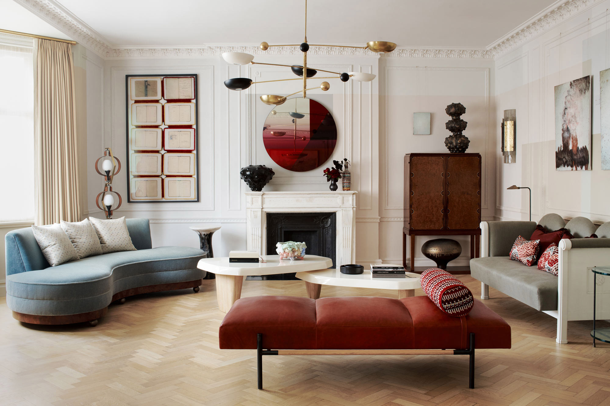
Marylebone Pied-à-Terre
This pied-à-terre in a 1920s building in Marylebone was replete with period details. The two-bedroom apartment is the London residence of a Los Angles based couple who wanted an elegant canvas to display their growing contemporary art collection.
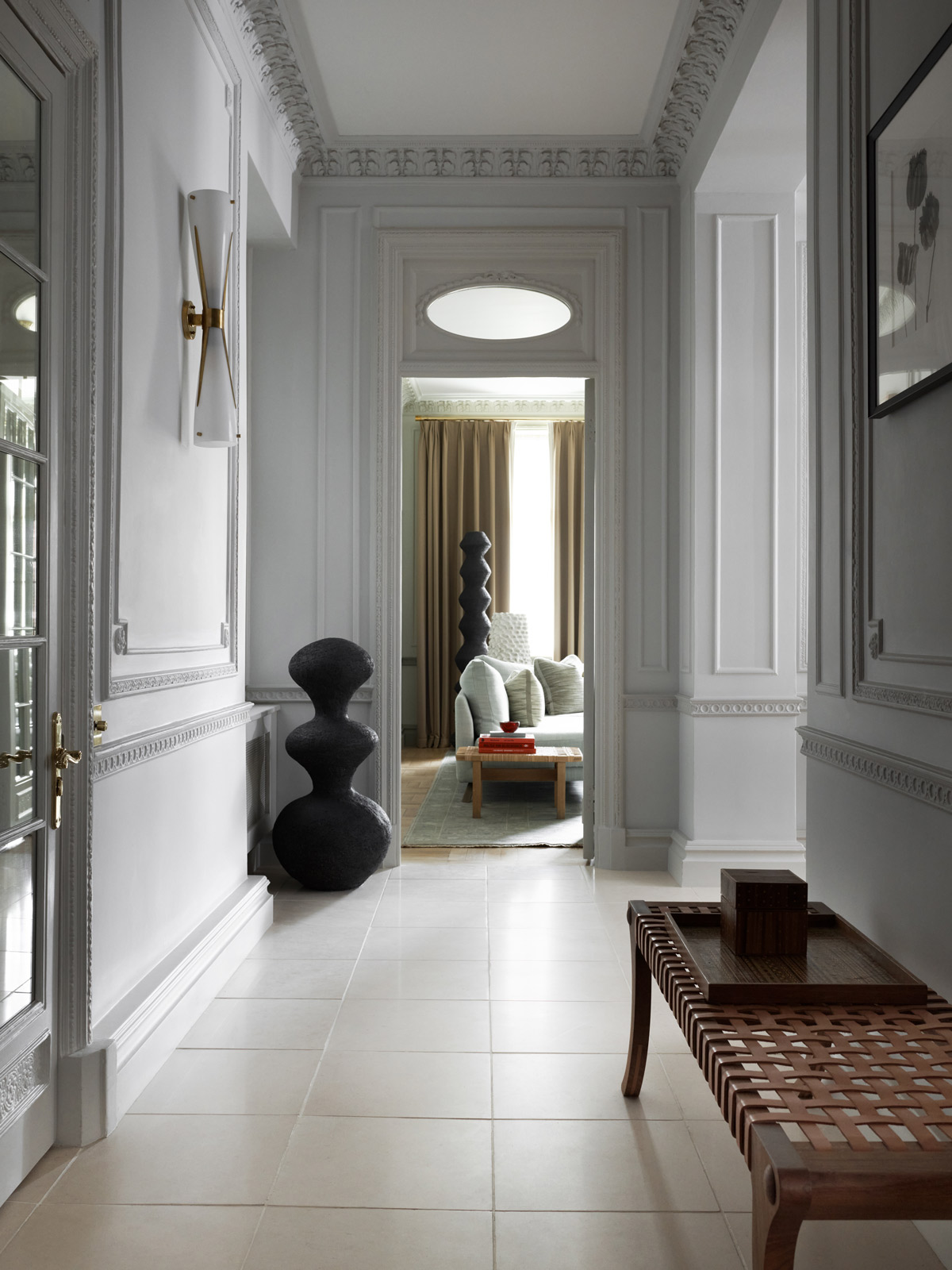
The residence had incredible features to work with which provided the scheme with a sense of timelessness and character, such as original mouldings and parquet flooring. We felt it was important to blur the line between being able to tell if something was original or new which allowed us to push boundaries and flex our artistic ideas.
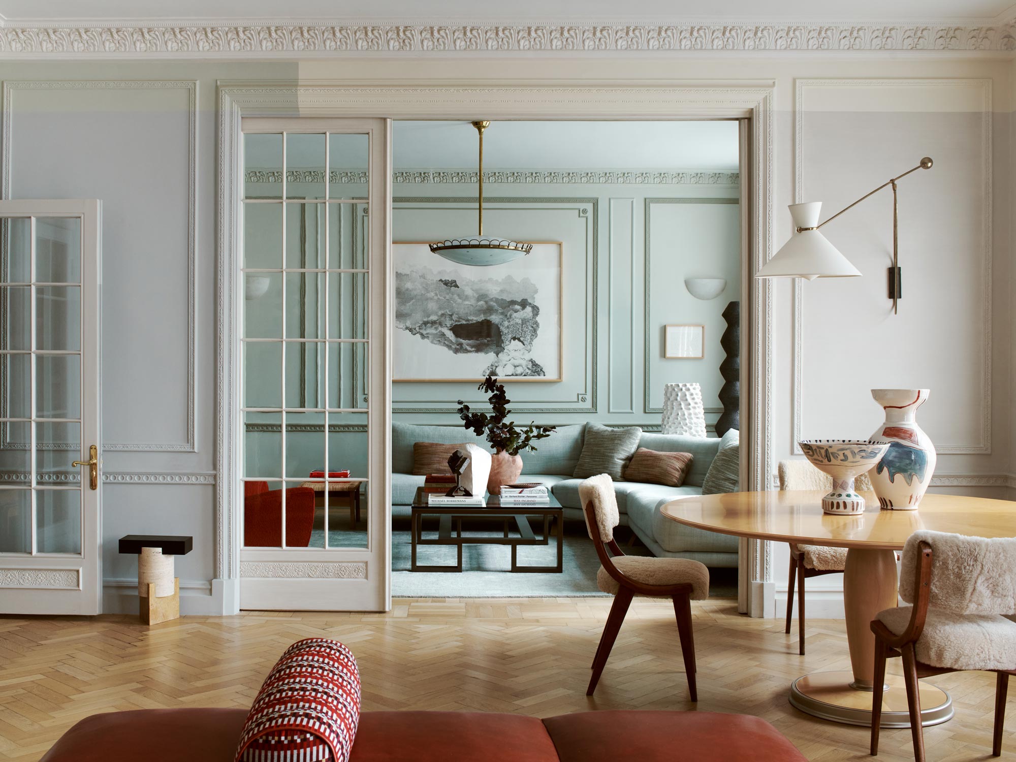
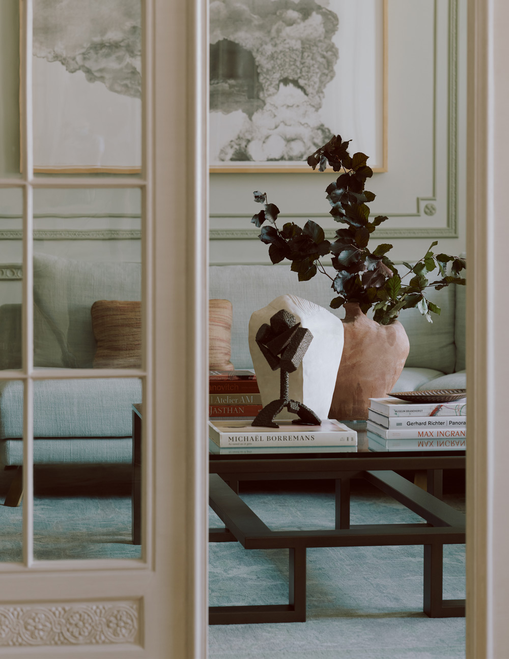
The main room contains both the sitting and dining areas and to ensure a gradual transition between these areas we used a combination of shades to layer shapes over the existing wall panelling. Colour experimentation continued in the adjoining library with three different shades of green to highlight the original mouldings.
The residence is a mix of bespoke, contemporary, and vintage pieces with clean lines and simple yet interesting forms which playfully complement each other.
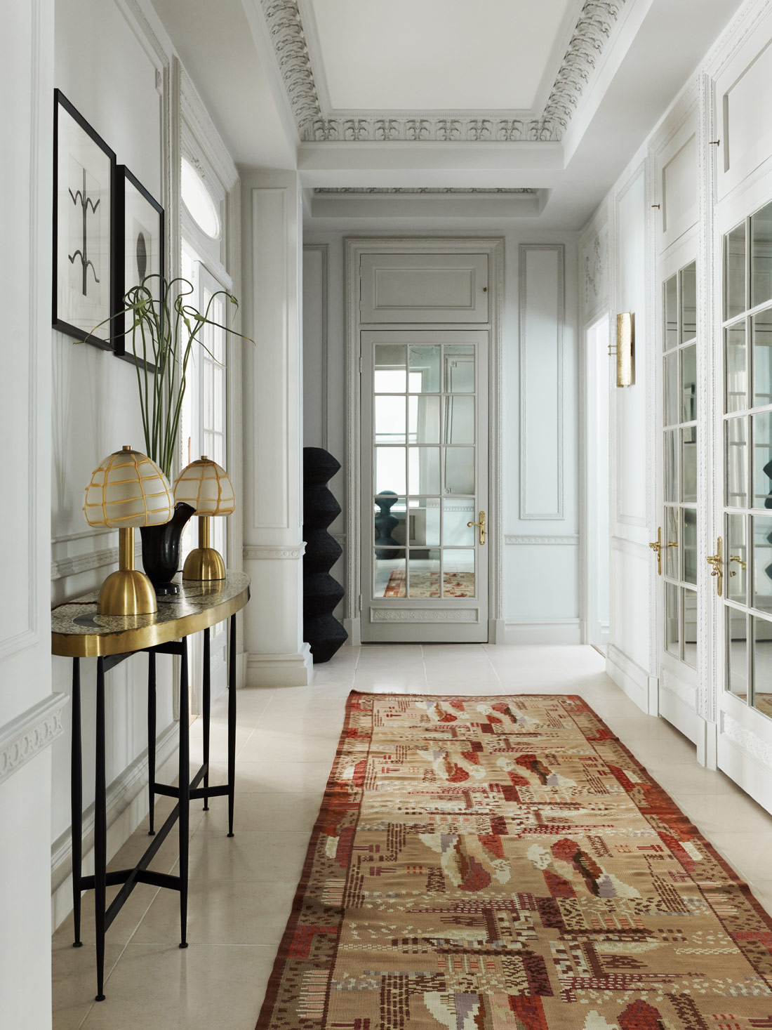
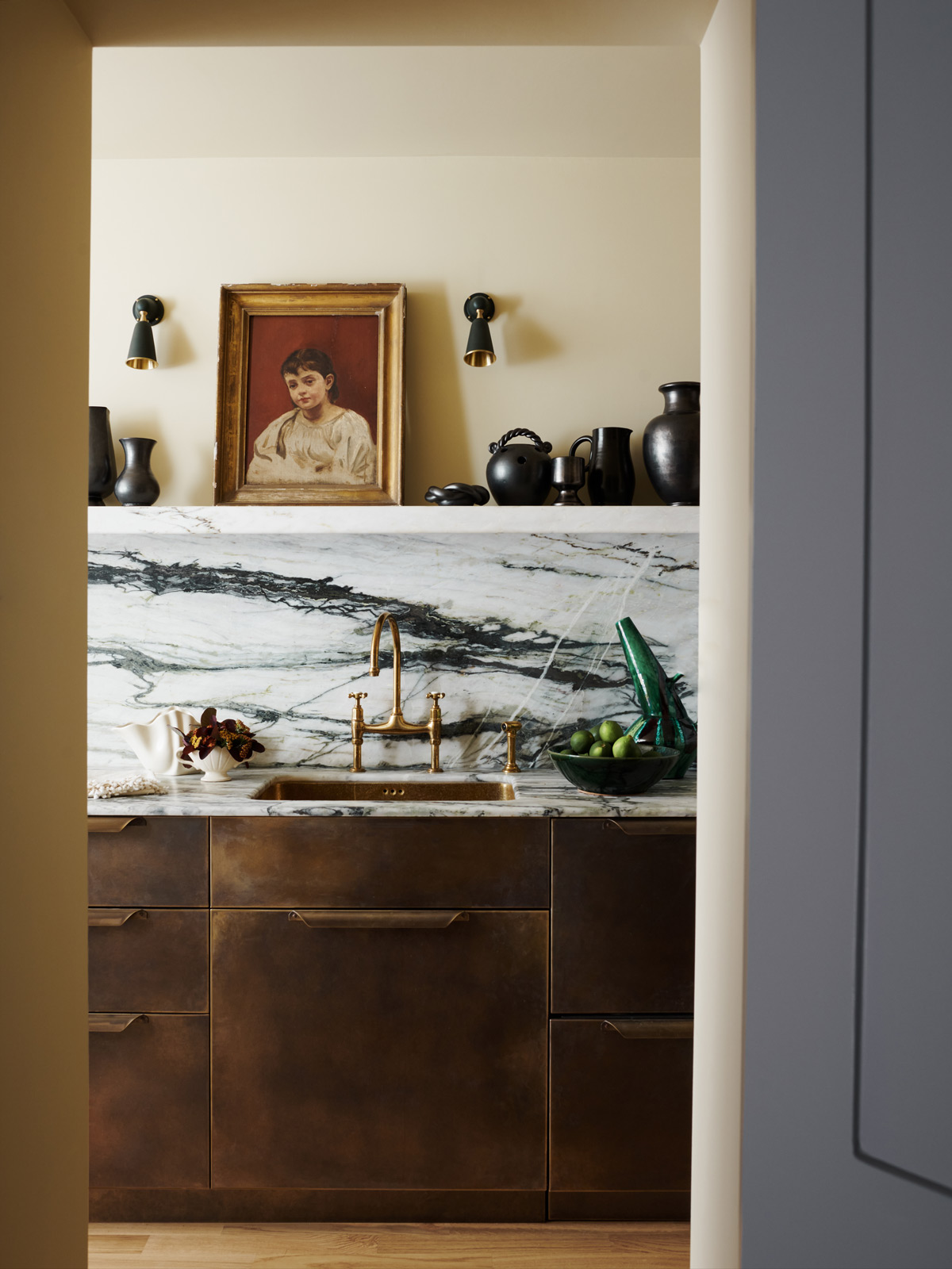
Given this apartment isn’t the owners main residence, the kitchen wasn't high on their list of priorities in terms of space – they love to eat out when in town. The galley kitchen is small but perfectly formed.
This neat and compact brass-clad kitchen is tucked away off the main hallway, but still has a point of view. We chose slabs of arabescato verde for an injection of subtle colour and painted the room in a delightfully edible colour, sesame, from Paint Library London which created a lovely vignette, visible through the open door.
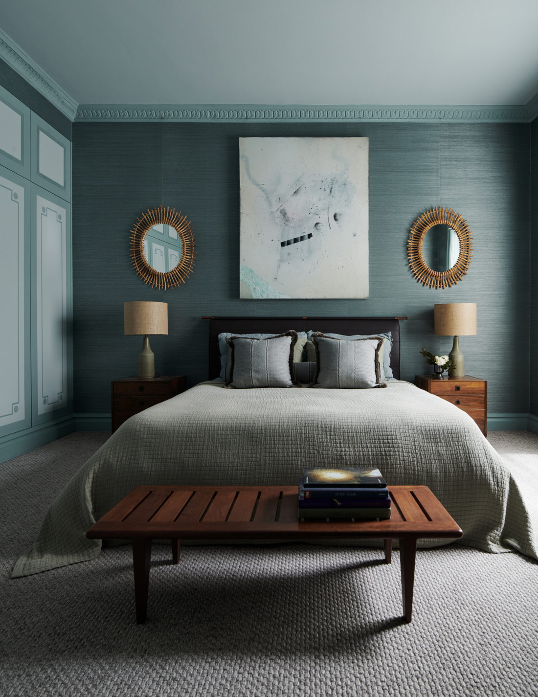
The dark blue in the master bedroom gives a soulful backdrop which allowed us to create a unique curation of textures achieved through bespoke textiles.
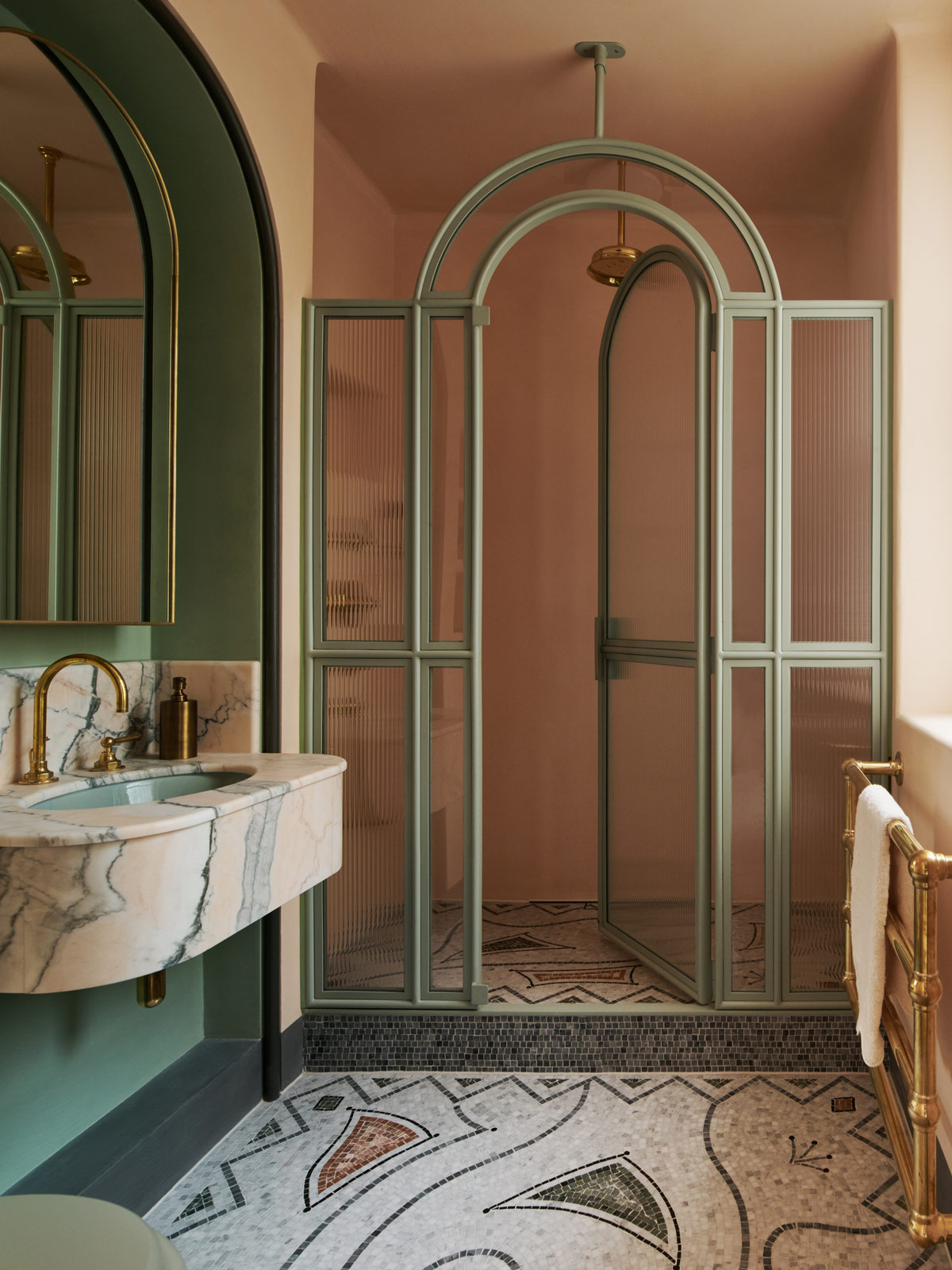
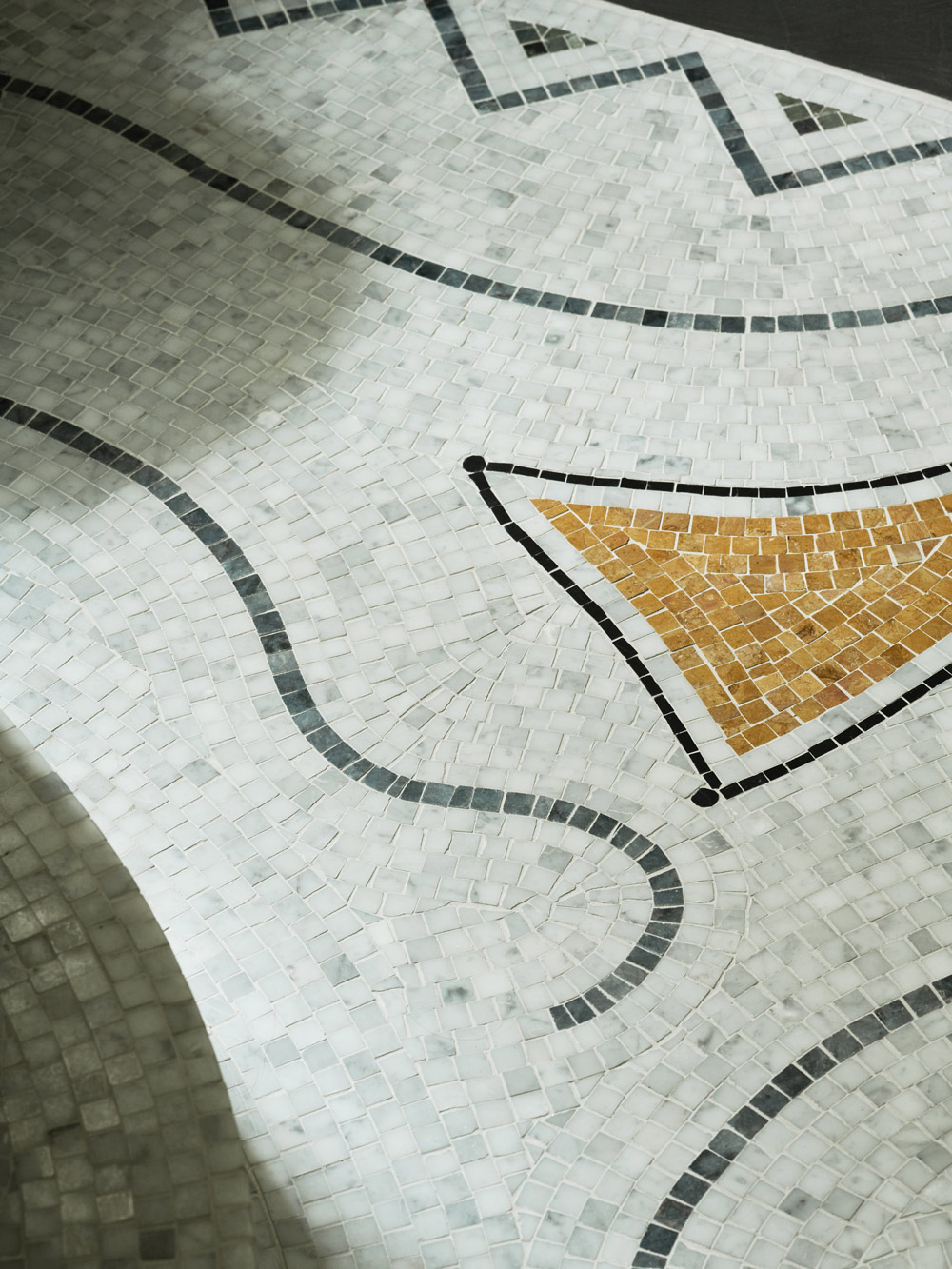
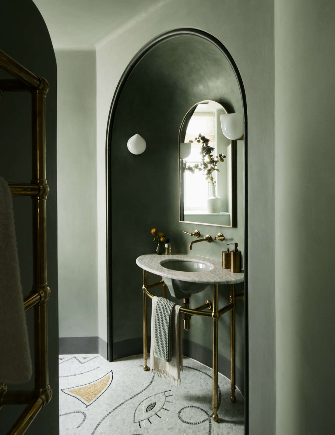
The property has two ensuite bathrooms. We created a unifying theme for both, with intricate Jean Cocteau inspired mosaic floors, and polished plaster walls. Soft colour palettes for all sanitary ware (what a joy to have options other than white!) and curved arches evoke a feeling of 1920’s glamour, intrinsic to the fabric of the building.
The bespoke metal shower screen made to our own design simultaneously competes this stunning vignette and provides for elegant function.
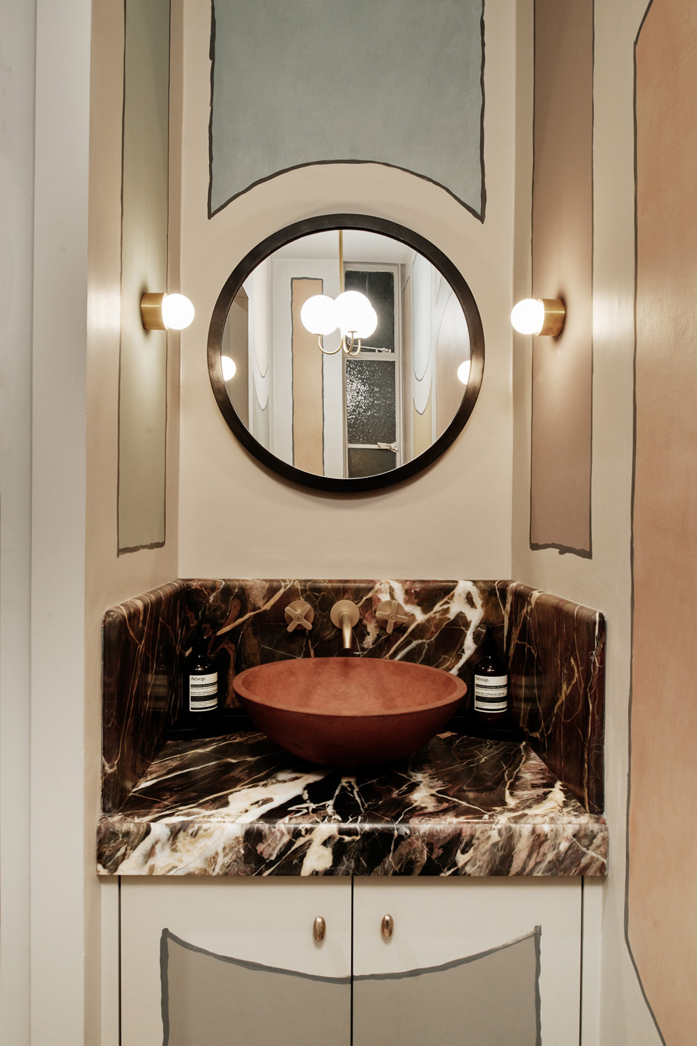
A playful panelled powder room. We worked with Isabelle Day to develop a loose, illustrative hand painted faux panel motif drawn from works from the same period by French artist from Christian Berard.
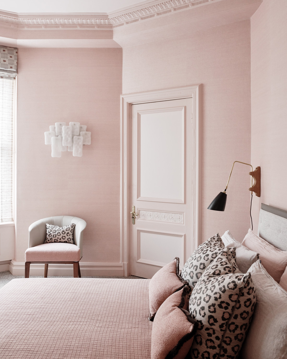
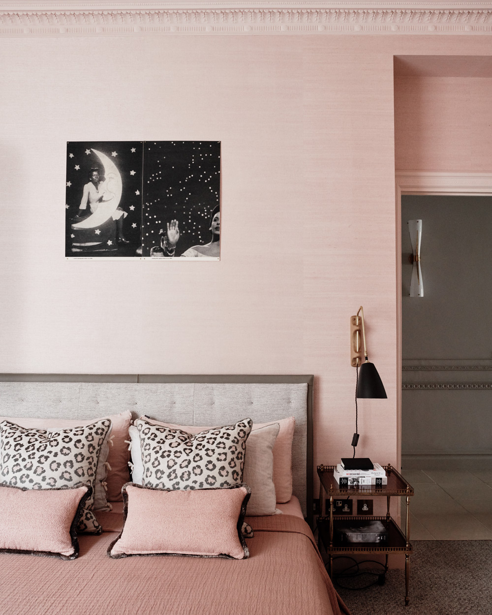
The soft pink in the guest bedroom makes for a room which feels fresh.
Featuring original cabinetry and decorative mouldings, we juxtaposed vintage and contemporary elements of several periods and styles to create a soft and subtle space for slumber, featuring a magical artwork from Lorna Simpson above the bed.
The subtle pink of the guest bedroom is carried through into the guest’s bathroom en-suite where it is balanced by buttery green accents.
Photography – Michael Sinclair